Quality Printing
Services
Fast Turnaround
Time
Next Day
Delivery Available
Green Credentials
Carbon Smart
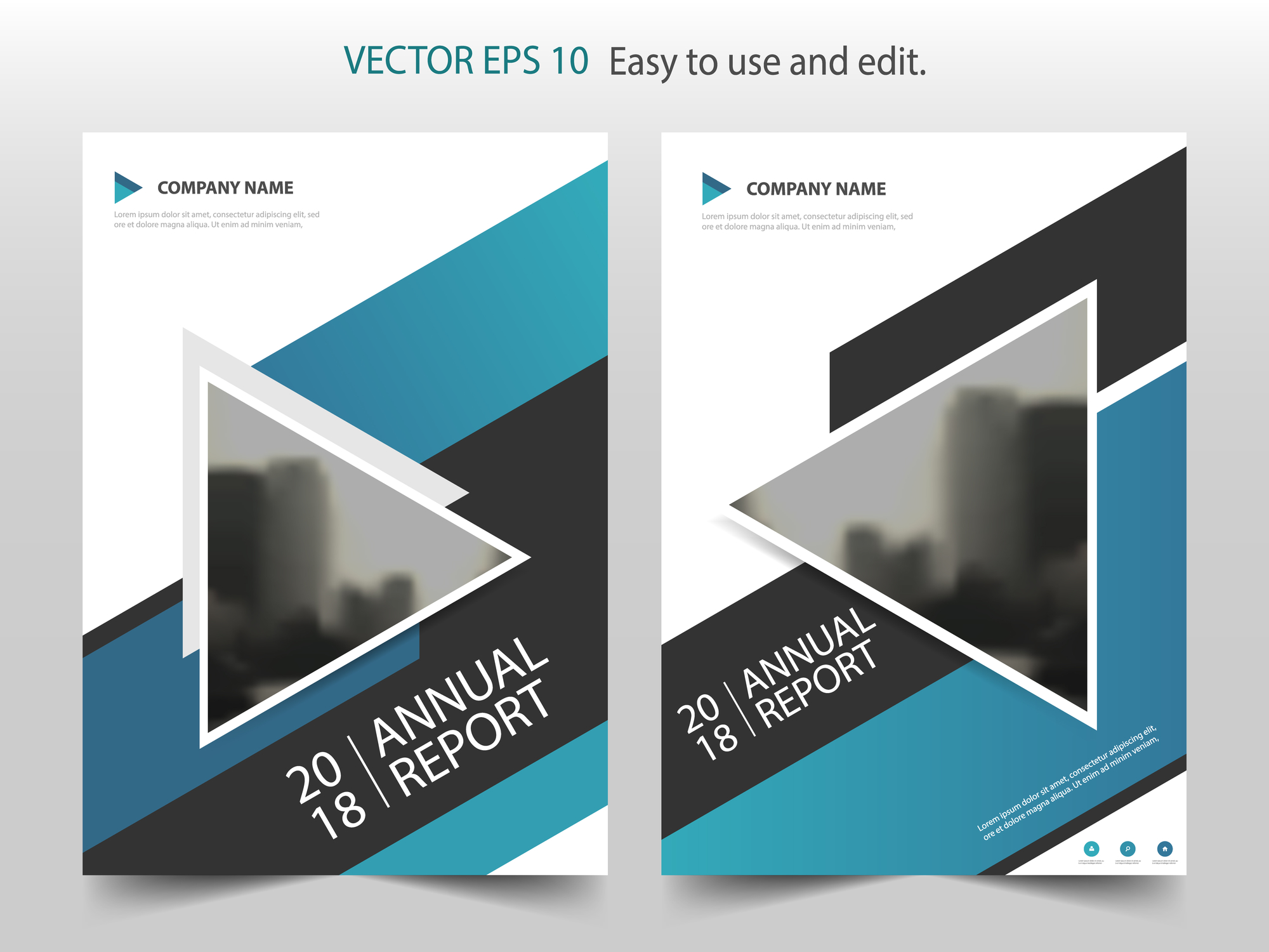
Brochures can be great for spreading the word about your products or convincing new clients to get in touch, but how do you create a good brochure?

The best way to judge a brochure is by how well it fulfils its goal. You should have a clear idea of what you want to achieve before you start writing the brochure. This goal should guide all of your design and content decisions. Ideally, it should be something that you can measure so that you can judge how well your brochure achieved its goal at the end. For example:
A good brochure will be able to get the readers to perform a specific action. It should appeal to the right target audience and convince them to do what you want them to.
Having a clear audience and aim in mind should help you to create an effective brochure and to judge how well it performed. However, it isn’t always easy to know how to achieve your goals. Here are some key points you should consider:
Make sure that you know who your readers are, whether you’re drawing on market research or your own experiences. The brochure needs to contain material that is of interest to your audience, so try to put yourself in their position. Are you creating a serious, technical brochure for industry experts or a cheerful, colourful brochure to appeal to young customers?
Brochures only work well when people take the time to open them and look aside. This means that your cover needs to convince someone to pick the brochure up and turn the pages. You can use pictures, colours and big letters to catch people’s eye, but you also need to give them a good idea of what they will find inside.
The style choices you make need to appeal to your target audience while staying consistent with your brand. Every choice you make, from the colours to the paper type, will say something about you, so make sure they’re sending the right message.
A good brochure should be easy for the readers to understand, even if they’re just skimming. Your brochure may also need to be accessible for people with different needs. Make sure your text is readable and use the layout to highlight the important bits and guide people through the brochure. Headings, borders and bullet points can all be useful.
A good brochure should get people to do something, whether that is to visit your website, donate money, place and order, or visit your business. You need to make it as easy as possible for people to take this step, so make sure that the essential details (like your phone number or address) are easy to find.

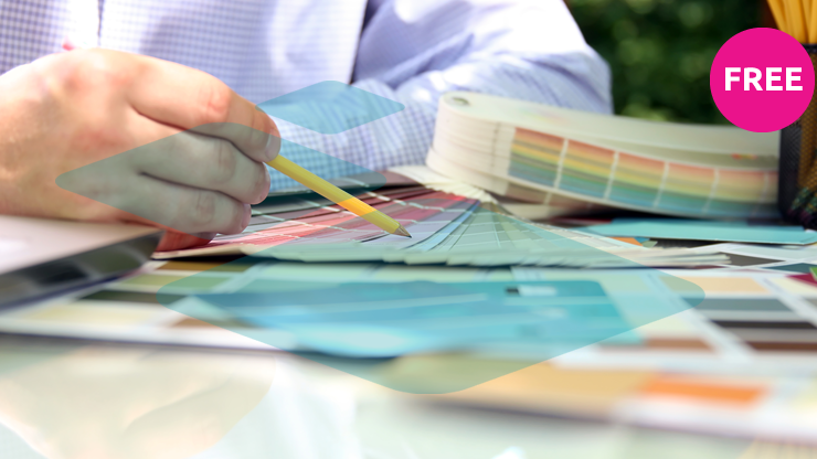
Our sample packs provide a small sample of EVERY product we offer, including all the different finishes for each product, so if you are still a little unsure of which material you would prefer, simply enter your details and we’ll get one sent to you as soon as we can.
Please mention in the comments box if there is a specific material you would like to test drive so we can ensure that you definitely receive it!